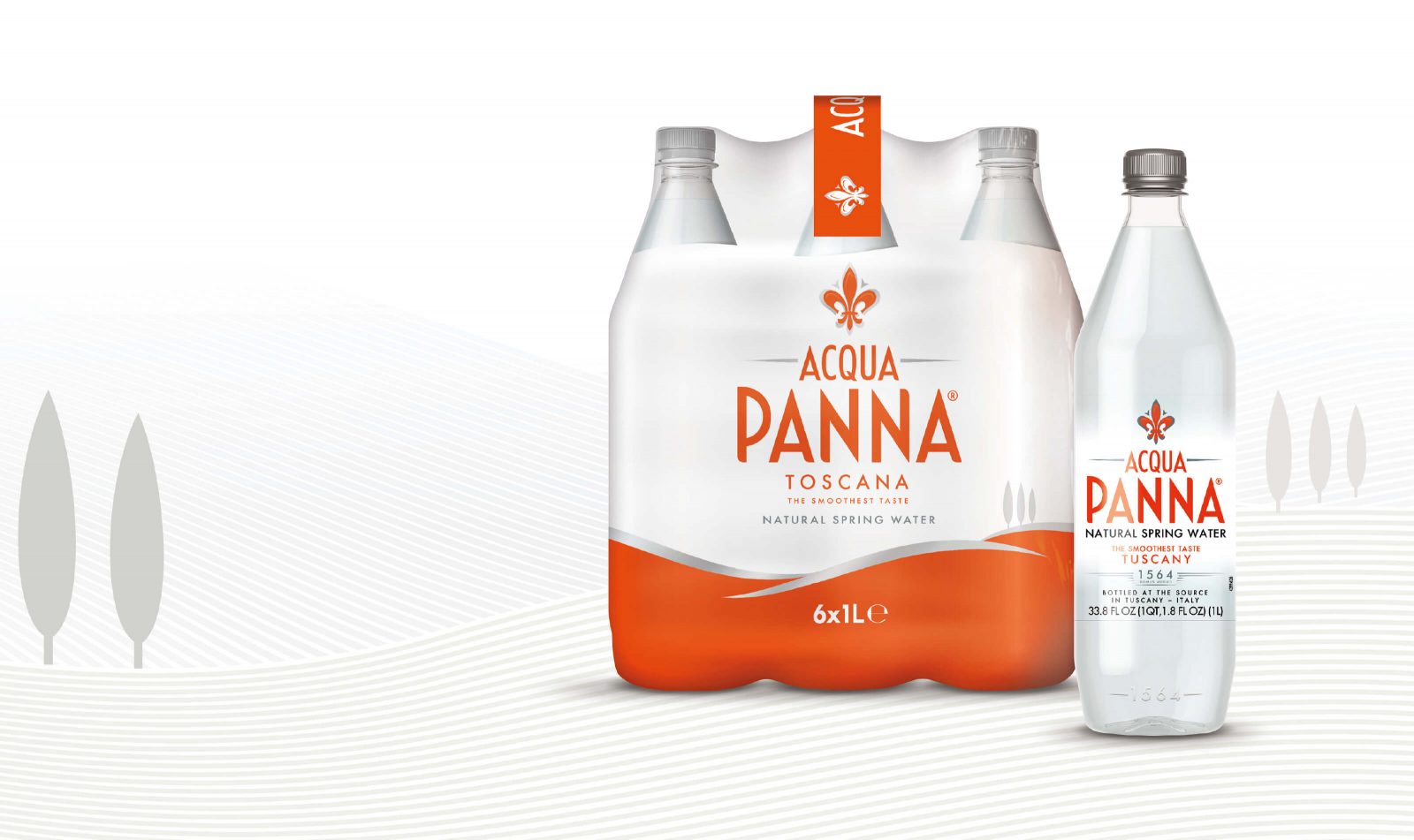
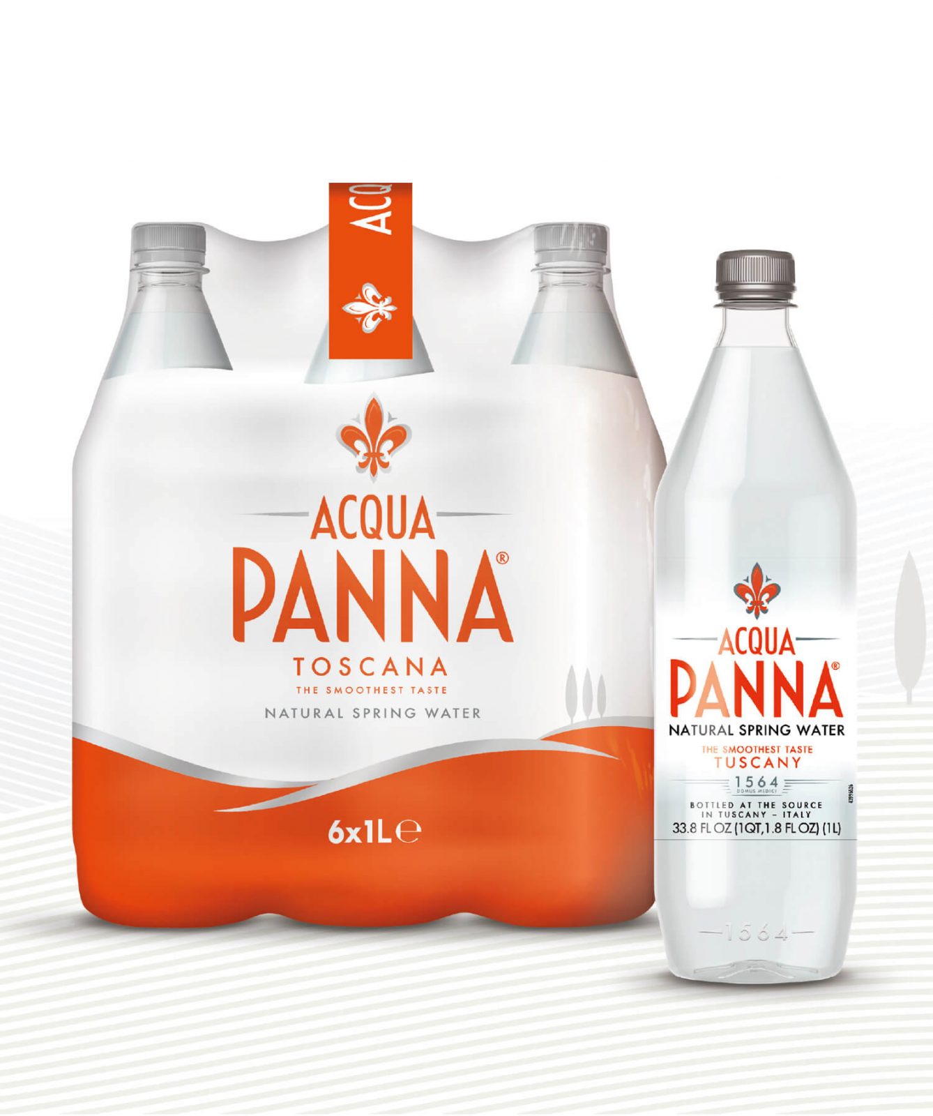
ACQUA PANNA
THE PROBLEM
A strong heritage brand with Tuscany at its heart, Acqua Panna was not seen as relevant for modern consumption occasions and was under pressure from the growing competition of regional players. The time had come to focus the brand on a more international market and transform it into a global icon.
THE APPROACH
Our research uncovered visual and verbal codes, as well as foundation elements for the positioning that provided opportunities to communicate qualities such as sophistication, naturalness and purity.
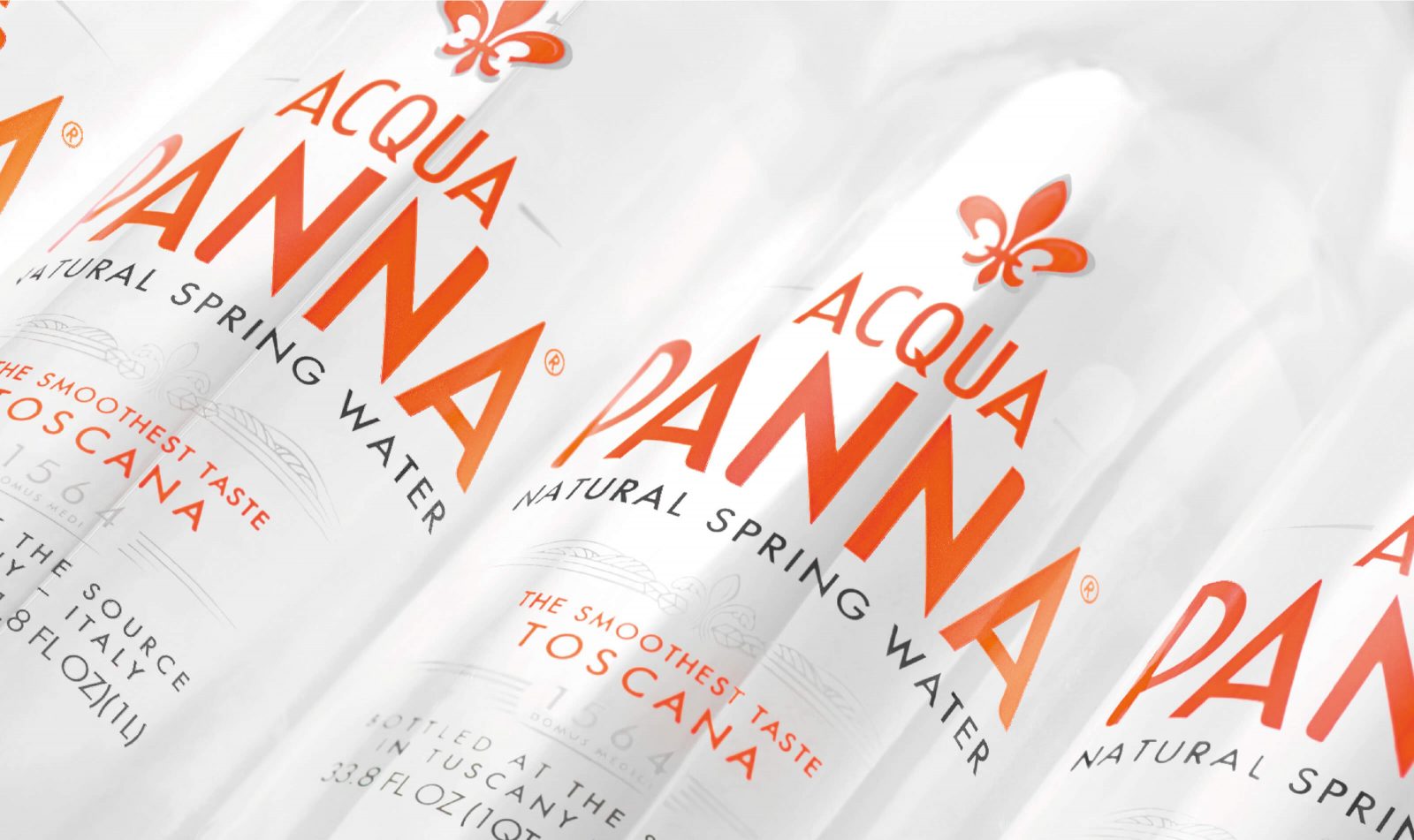
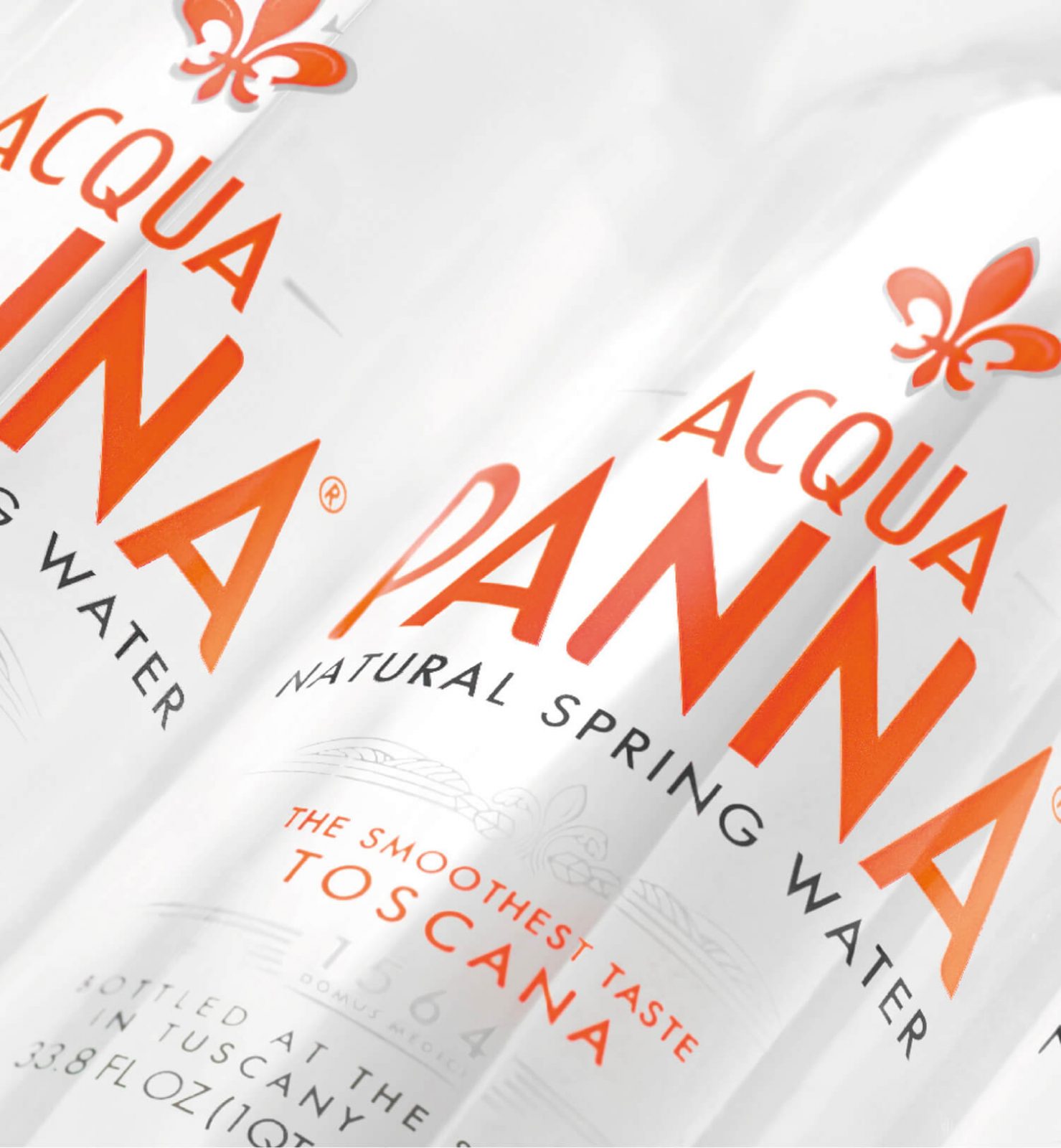
A new brand story was crafted, highlighting the best Tuscany has to offer whilst making it relevant for the global consumer. We then explored how to bring this story to life, focusing on ‘Panna’ and the creation of a new visual identity system and the development of with a refined 3D bottle shape.
THE SOLUTION
The resulting transformation introduces Acqua Panna as a sleek, sophisticated symbol of Tuscany, but does so in a modern, elegant and aspirational way that is now relevant to everyday life.
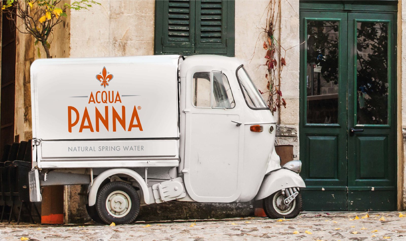
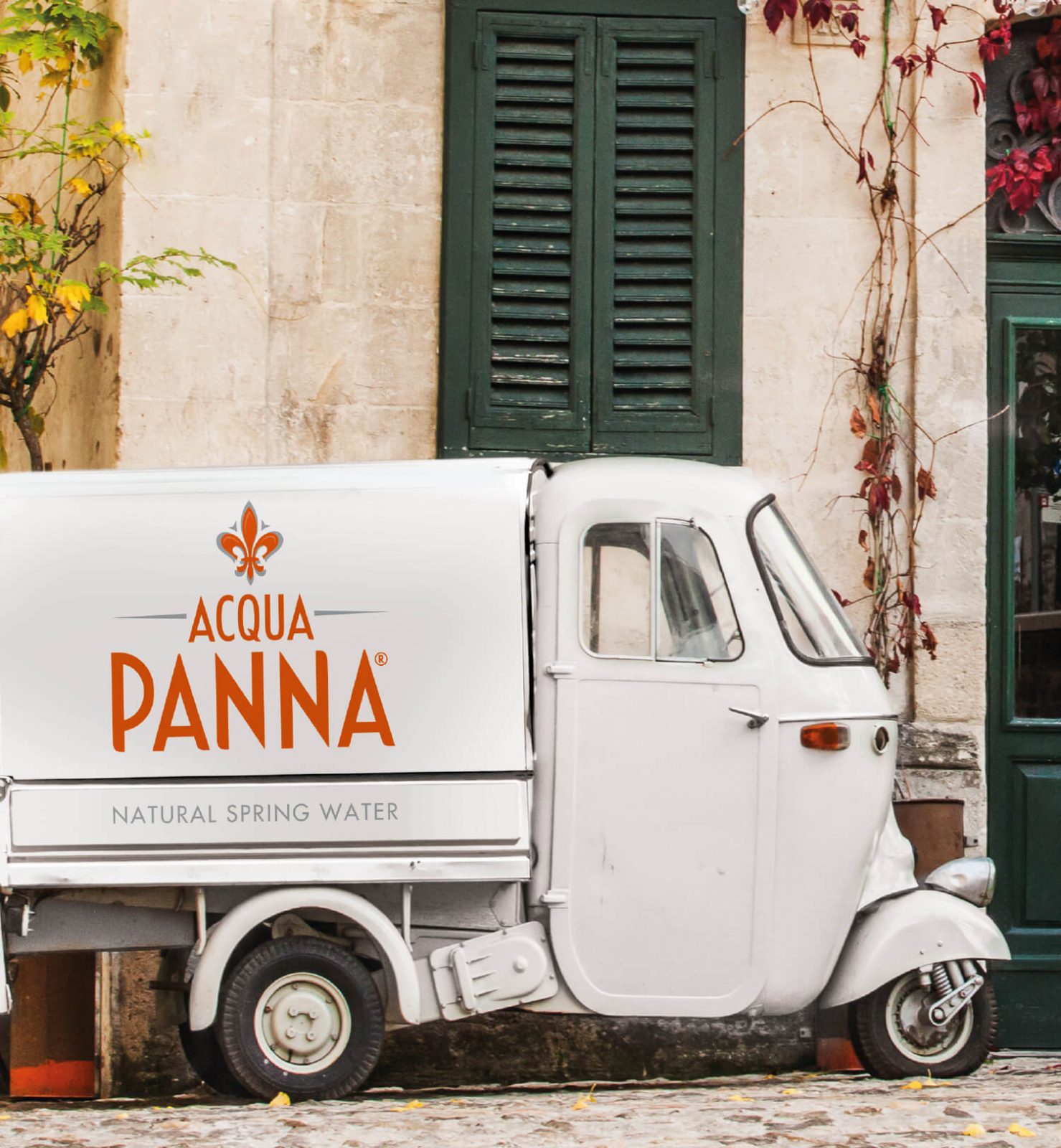
The strategy and packaging design was followed by the creation of a comprehensive Brand World which includes coherent yet different solutions for both local and global markets.
