Strepsils
THE PROBLEM
Historical development of Strepsils on a market-by-market level had led to a fragmented visual identity and lack of coherence within the global product portfolio. Coupled with stiff competition from own-label brands – Strepsils sales were seeing a downward turn.
THE APPROACH
How could we make a classic brand with years of heritage more iconic and create a re-design that showcases Strepsils’ unique ability to both treat and relieve sore throats?
The solution would also have to create global alignment across 170 markets through a consistent look and feel.
THE SOLUTION
Focussing on the creative idea of ‘Throat Harmony’, we created a bold and dynamic brand asset that puts the brand’s dual action at the heart of its visual identity.
Symbolising the power of balance, one side reflects the caring nature of the brand through soothing and flavoursome liquid visuals, the other side represents Strepsils’ unrivalled scientific expertise. The result is a strong and iconic brand mark that can be used on and off pack.

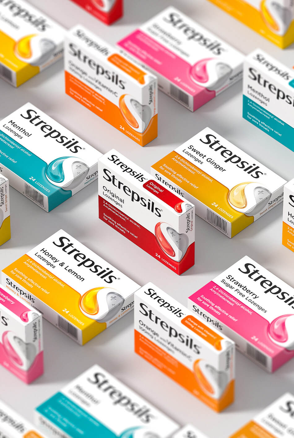
SYMBOLISING THE POWER OF BALANCE
The new identity reflects both the caring nature of the brand AND Strepsils’ unrivalled scientific expertise coming together to create a powerful connection.